Our April 2022 Facebook Ads Tests
Facebook Ads Guide
Every month, our expert team of Media Buyers performs a series of Facebook Ads Tests to offer you expert tips on how to optimize your campaigns and strategies.
We test funnels!
Here are the latest test results as of April 4th, 2022.

This week’s test starts here, with a personalized conversion campaign (Lead Generation) that has a cost per conversion that is known to be high and a particularly strong click-through rate despite that.
Translation: we get tons of leads in step 1 of our funnel and much less in step 2.

This is our sales page before our test (Step 2 - after prospects get access to the free lead magnet.) The objective is to push prospects even further along in the sales process.
So, we decided to test out various variants, and one, in particular, drew our attention.

We changed the header image to match our new approach, Start your renovations this spring, and also added an element of time to encourage prospects to take action.
This new version worked so well that we immediately tried a similar variant, this time even simpler.

We removed a question from the form and added client reviews at the top.
These small changes allowed us to boost conversions on our two main conversion channels:
- From 11% to 20% (9% more!)
- From 9% to 14% (5,5%)
That’s huge!
We launched this test in March, and here are our results in the Ads Manager.

- The CPL decreased by 21%
- The CPA decreased by 18.88%
- The CTR increased by 17.31%
It's impressive how improving your sales funnel can impact other vital metrics, including the ratio of people clicking on your ad! Looking at the customer back end, the number of 'Details Submissions’ increased by 50! This means the cost displayed by Facebook should be even lower.
The lesson here is to read your metrics carefully. If there is a high click-through rate but expensive ‘conversion actions' afterward, your problem lies outside of Facebook.
Our FB campaign is going crazy! What do I do?
A common problem in the Ads Manager
Here are the results of our latest test as of April 11th, 2022.
It’s terrible…what Media Buyers have to do for Facebook Ads sometimes.
One morning you wake up, and you see that your acquisition campaign has generated great results over the past month.

You feel good. Great even. The sun is shining, and the birds are singing.
Integration is going smooth, and the Ads Manager isn’t even bugging!
But, things don’t always go as such. One morning, you wake up to torrential downpour and the birds are gone. You turn on your computer and this is what you see in the Ads Manager.

Time for a round of optimizations:
- Variations of your best ads
- Test out new audiences
- Test out new Hooks
- Launch a new offer for your acquisition campaign

But, nothing works. 2 weeks into March and your results are still low.

When you find yourself in a similar situation, and you’ve done everything to improve your campaign, there’s still one solution left to consider.
Sometimes, your campaigns just go “crazy.” Maybe it has run its course, and you need to let it go, but not before you take a look at your history.😏
Look back on the most prosperous months of your campaign and determine which elements were the most successful.

Then take those elements and create a whole new campaign.


The lesson here is simple: Never give up without trying what has worked in the past. The Squad has proven many times that it’s important to keep an eye on your past victories because they may serve you well in the future.
Second, all campaigns have an invisible ceiling. A simple increase can tip it over, and sometimes the campaign just tips over on its own. Don’t get tied down – figure out what’s wrong and make the necessary changes.
FB Ads: What creatives should you use?
We run tests for an e-commerce
Here are the results of our latest test as of April 18th, 2022.
What’s great about Facebook Ads is that there are no absolute truths.
There are tests.
From experience, we’ve noticed that some clients live off of carousels, others only succeed with videos, and some thrive with a mix of both formats.
But, the format is but one element. Once you choose your ad format, what’s left to test? The visual, of course.
And that’s exactly what we did with this campaign.

You’ll notice something different in this campaign, which we rarely ever do: This campaign uses ABO (Ad Set Budget Optimization) rather than CBO. Why? The reason is simple: We want precise answers.
The client in question is an e-commerce that sells tactical and military gear.
One of the questions we’ve probably pondered the most with this client is: Do we show the product in action or not?
Does a simple photo of the product allow us to communicate its usefulness to our audience, or do we need to show the product in action to make a stronger impression? We’d never tested out this hypothesis before, but this time, we made a decision.
In this ABO campaign, we used the same two audiences and the same budget. We chose to advertise the best-selling products to ensure that we would generate a minimum number of purchases (we are testing the advertising approach after all, not the product).

As you can see, we created a “Lifestyle” (‘action shot’) version and a “Product” version (product photo on a white background) that simply included the logo of the brand. We used the same copy for each version.
The test lasted several weeks, and here are the broadcast/engagement results.

Our ‘Design’ (Lifestyle) ads achieved a much higher click-through rate but no drastic difference in CPM.

The Design ads also generated more add-to-carts (for 3x less money), but the average cart value is the same for both segments.
The craziest is yet to come.

Complete reversal of the situation: Our ‘Simple' ads converted far more than the Design ads in terms of volume, but the ROI is pretty similar in the end.
But when you look at the ads, two different products (of completely different) styles are what worked.

Could it be that this visuals test does not impact the overall store but the sales of each individual product? That some products can do with a simple image, while others require the customer to see ‘themselves’ using the product?
It's up to you to test it!
Your FB Ads offer isn’t working?
Try this!
Here are the latest test results as of April 25th, 2022.
E-commerce is often referred to as a ‘nemesis' for physical stores. But when you're a brand that sells both in-store and online, do you know what sometimes happens?
The opposite.
Who would buy a product online when you have to pay shipping fees (and wait) when you can immediately get it in-store?
Not all e-commerce businesses can boast having the same resources or logistics as Amazon, the giant that made it normal to receive a product the day after ordering.
This is a problem one of our clients recently encountered. Their in-store sales exploded in February, while we ended the month with a decrease in results.

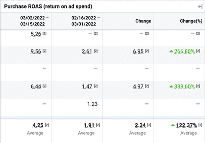
Note that the Valentine's Day offer failed to boost the account’s ROAS
So, what do you do when product sales are better in-store than online? The answer is simple: You change your offer. Because if consumers don’t find an interest in buying online, it’s because your online offer simply can’t compete.
We decided to kick off March using a different approach. Maple syrup season was approaching, so we pitched two special offers to our client.
Our first offer was a free gift with any purchase of this season’s new arrival.

The second offer was a discount of just under 20% for a bundle only sold online.

The Maple Syrup Bundle, specially created for the season
The campaigns were set up in this way:
- Broad audience and a retargeting audience, due to the offers’ limited nature
- A daily budget, which is much easier to scale if the campaigns are working (We also didn’t set a limit in the case that the campaigns succeeded)
- Widest attribution window, with a conversion objective
- No indication of when the offers were expiring in the copy in case we needed to stop the campaigns (otherwise, the campaigns would run until the end of the season, March 31st)
Here are the results of the campaigns over 21 days.

Note that the ‘free wooden spoon’ offer worked best overall. The bundle offer did manage to reach a large audience but did not convert as much, most likely because of the price difference between the two, resulting in Facebook pushing the less expensive offer to generate more volume.
The lesson here is that when your sales channels aren’t converting at the same level, it’s sometimes necessary to create a dedicated offer for the one that is making fewer sales (in this case, Facebook Ads). A simple free gift can make all the difference. And in due time, we’ll also look at how a simple copy tweak can affect your results!


